MOOD BOARD
This is a mood board which I created in order to highlight by biggest inspirations. I have selected various designs all from progressive house genre. This selection of album and poster designs has already influenced by within the contraction process of my magazine in relation to the ancillary task. I have been looking throughout our location journeys at compositions which will influence my own designs. Within the mood board I have been particularly interested in the maze design of band 'Years and Years'. This strongly linked to our product as we have used a natural maze location within our video. Another thought I have kept in mind is the use of rich color scheme full of vibrant tones, delicate and flowing smoke but also various textures. Within the photograph shots my aim was to keep the composition simple in order to develop it digitally.
This is a first set of primary photographs which I have captured during our filming process. I have particularly focused on primary compositions which will allow me to develop my editing skills.
PRACTICE SHOTS DURING FILMING
This is a first set of primary photographs which I have captured during our filming process. I have particularly focused on primary compositions which will allow me to develop my editing skills.
- NATURAL MAZE: The first location was based around the natural maze in Perivale. My aim was to capture the shape of the maze revealing and reinforcing the sense of confusion and journey. One problem which I have found within this location was the height. I wasn't able to capture full form of the maze. To challenge this problem I have climbed up to the tend located at the middle of the maze. This helped to create high angle shots. My intention of using the maze within my ancillary task was particularly inspired by the 'Years & Years' album cover titled 'Communion' which can be seen above within my mood board. Besides, from that I thought it would link really well with the subject of our product and involvement of this location. Within the development I am planning to implement abstract color scheme, manipulate the texture and form of the composition. I am strongly considering cropping and rotating the images in order to reinforce and highlight the shape and use of lines.
- TWIGS AND LEAVES:
- Another approach to my photography was focused on zoom in shots abstract and tangled twigs and leaves. Firstly, I have captured twigs on a brick background which created sense of confusion. My initial through was to develop the photograph by applying color into the gaps, creating an impression of a collage. This would successfully complement with the progressive house genre which is dominated by various textures, geometrical breakdown and rich color schemes. Besides, from that I want to try complementing the close up shots of twigs within fuller shape such as heart. This will successfully add shape and pattern.
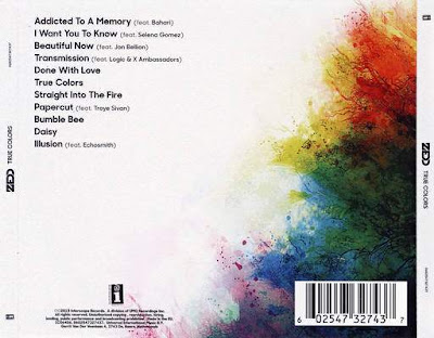
- Within the journey I have also focused on capturing the leaves and twigs within a plain background. The light exposure of the sky has significantly allowed me to capture the natural movement of a growing tree. I really like these photographs as I think they would successfully suit within the back cover of my digipak, creating clear space for the song titles. I was particularly inspired by Zedd's cover from the album 'True Colors' where the composition is successfully fading within the back cover. This use of natural form will strongly complement with the rough use of twigs, creating balanced composition.
 |
- TWIGS:Following from the previous set I wanted to capture the twig composition on a plain background, at the same time capturing a source of light. This worked really well as it complements with the progressive genre where designs often include sense of exposure for example; through smoke. At the same time the use of light allows to balance the composition bringing movement and flow to the overall arrangement. Within the development process I would want to focus on manipulating the colors and adding exaggerated effects for example of smoke. Besides, from that I would want to try to overlay the chaotic composition over typography. This effect is also often used within our genre, allowing to add color and texture to the composition, making it even more targeted at the genre at the same time reinforcing the impact on the typography. This use of typography is often used on plain backgrounds. The composition then becomes more modern and simple, bringing the theme of dynamic nature through the overlay. The example can be seen within 'Rudimental' album titled 'We The Generation'.
- LANTERNS:As I have mentioned before the use of shape and form is quite important within the progressive house genre. This is how I developed my idea of capturing an image of lanterns within the Oxford Street location. Similarly, to the twigs I have taken the photographs looking up, obtaining strong light exposure from the light, allowing me to focus the composition on the circular shape. As an development I am considering applying light and color effects to bring out motion and movement. I think the use of colorful smoke effect coming our from the circular shape would work quite successfully reinforcing the genre.

CONCLUSION
Within the next couple of days I will be focusing on gaining feedback from random audience, to make decisions about which direction I should go into. I will be also experimenting with Photoshop and other programs to visualize my initial thoughts and ideas. This will definitely help me and my respondents about the decisions. I will then follow their answers and opinions and start my construction process by next week.


No comments:
Post a Comment